Case study
Parwaz came to us as a name and an ambition. We gave it an identity, packaging, a launch and the marketing that came after. One team held the brand from the first sketch to the shelf to the feed, so nothing was lost along the way.
Industry
Personal care
Services
Branding, Packaging, Video & Motion, Social Media
Relationship
Concept to market
Mandate
Build the brand, then run it

The mark, drawn from the name: one fine line rises out of the lettering and becomes a bird in flight.
Personal care is decided at the shelf
Personal care in Pakistan is crowded, loud and bought in seconds. Shelves are packed with international names, local favorites and lookalikes of both. A new brand gets one glance from a shopper, and it has to make that glance count.
Online the pressure is the same, only faster. A feed gives a new name a fraction of a second before the thumb moves on.
In both places, the brands that win look like themselves everywhere. The brands that lose look like they were designed by a committee.
The brief
Parwaz had a product and a name with real lift. It did not yet have a face. It needed an identity, packaging that could hold its own on a shelf, content for launch and someone to run its marketing after. The usual answer is four vendors and four versions of the brand. Parwaz chose one team.
What it needed was harder than a logo: a brand that looked like one decision, made once and carried everywhere.
The insight
A new brand is most fragile in the gaps: between the logo and the box, the box and the photograph, the photograph and the post. Close the gaps and the brand arrives whole.
How we approached it
01
Start with the name
Parwaz means flight. Before anyone drew a line, we agreed the brand would carry that idea in every piece, so no element had to be invented from nothing.
02
Design the system, not the pieces
Color, type, layout and photography were set as one system before the packaging began. Every later decision had a rule to follow.
03
One team, no handovers
The people who drew the mark briefed the shoot and planned the launch. Nothing was translated from one vendor to the next, because there was no next vendor.
What we did
The identity
We built it around the idea already inside the name. One fine line rises out of the lettering and becomes a bird in flight: light, graceful, impossible to mistake. It holds as well on a label as it does in a feed. Around the mark sits a quiet system of type, color and spacing that keeps everything else in order.
The packaging
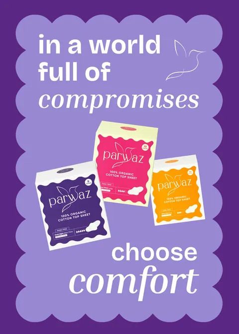
Designed as the brand's first salesperson, from concept to print-ready files. Clear in three seconds at the counter, worth keeping on the shelf at home. The hierarchy was set for the counter first: brand, then product, then benefit, readable at arm's length. Why three seconds matters.
The shoots
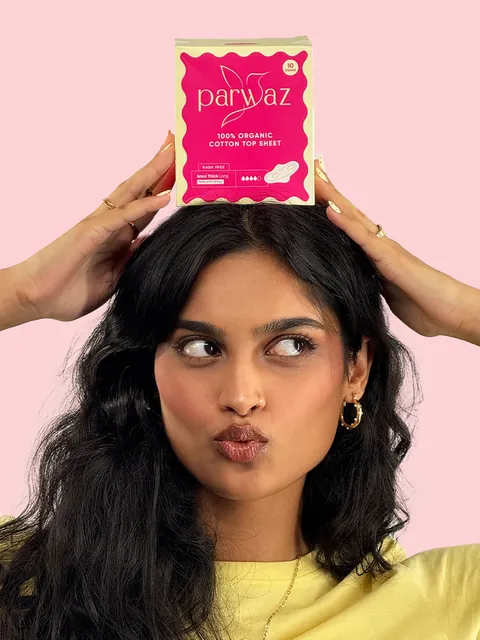
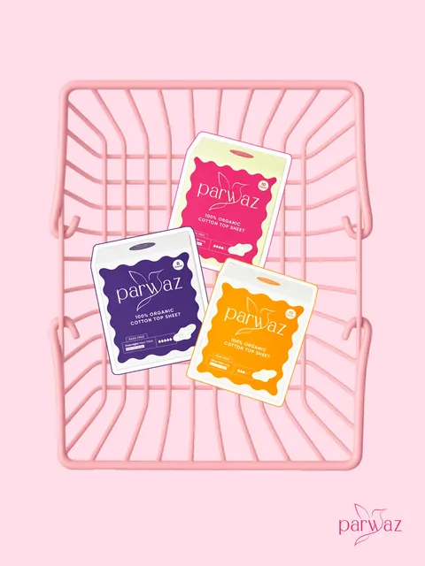
The team that drew the logo also chose the light. The photography looks like it came from the same hand as the mark. Styling and props echo the packaging, so the product looks at home in every frame.
The launch
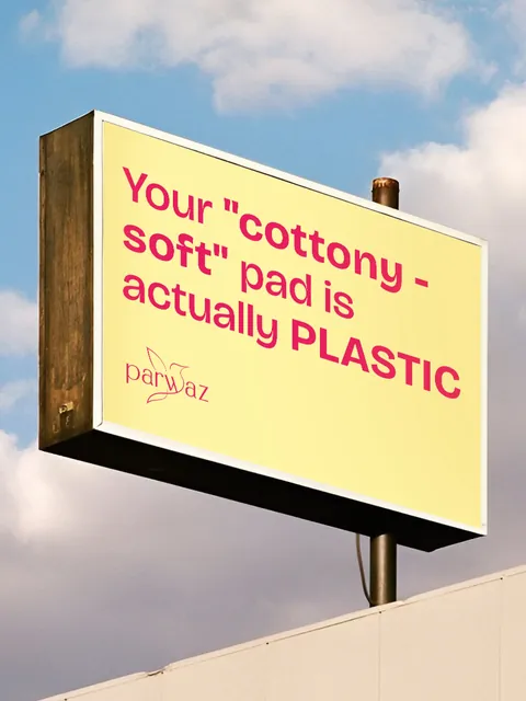
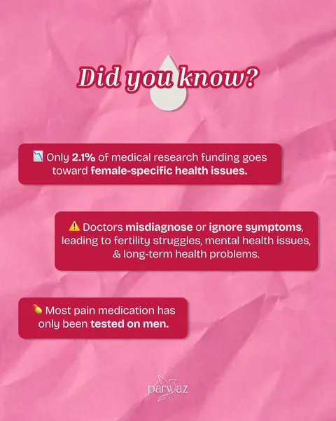
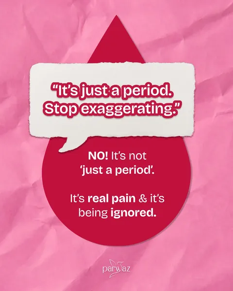
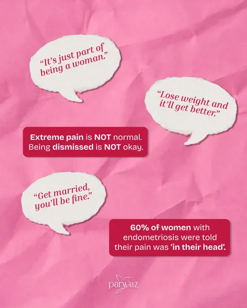
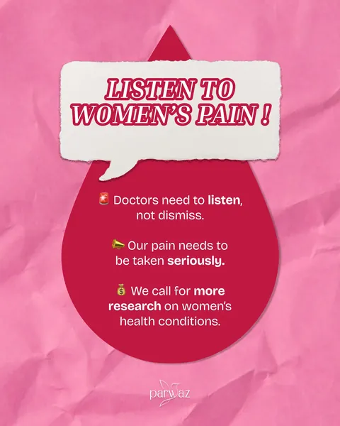
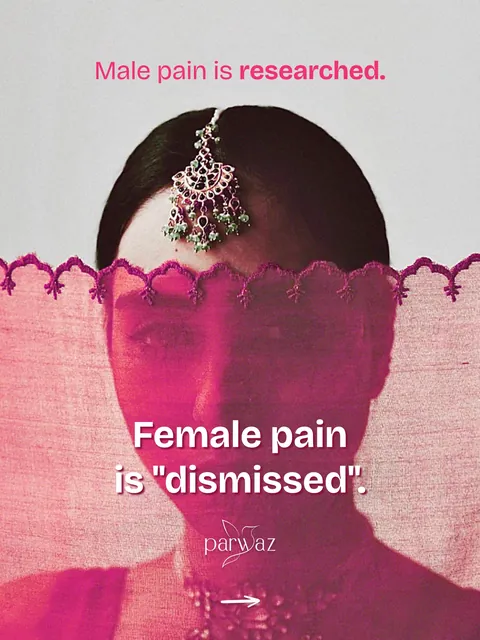
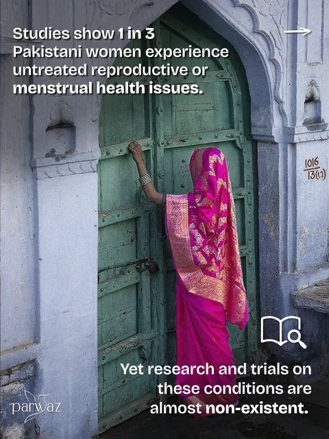
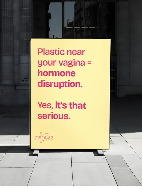
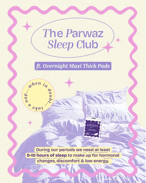
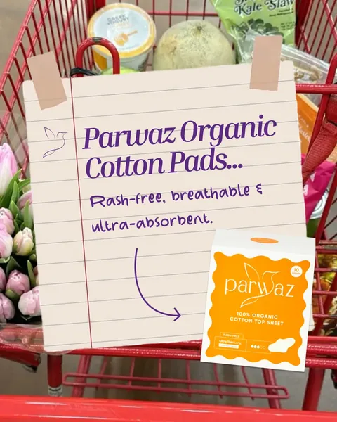
Parwaz arrived on social media the way its packaging promised: with a clear point of view and one consistent look from the very first post. The first weeks introduced the name and its meaning before they asked anyone to buy.
The marketing after
The same team kept running the brand. Each month built on the system instead of starting over. New posts, new formats and new products all draw on the same rules, so the brand grows without drifting.
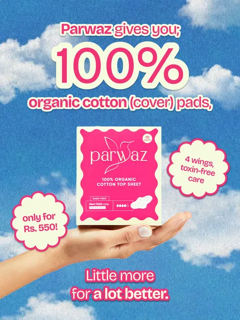
Brand, product, benefit: the hierarchy is set for a three-second glance at the counter.
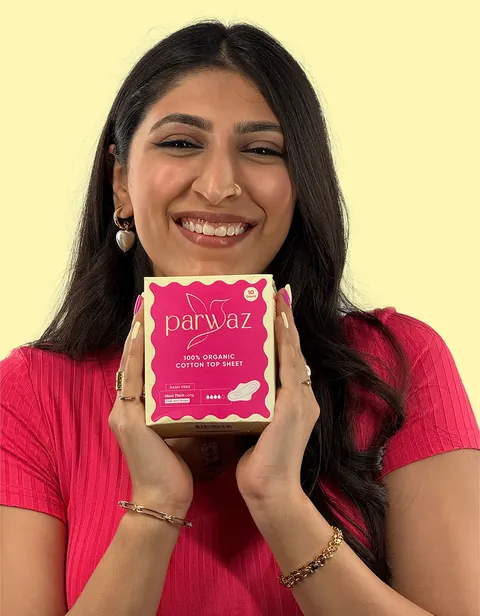
Directed by the team that drew the mark, in light chosen to match the box.
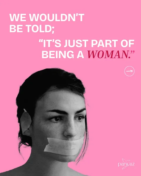
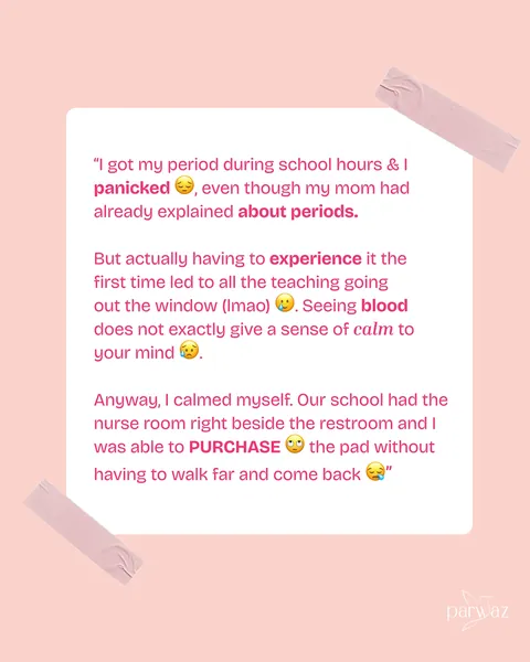
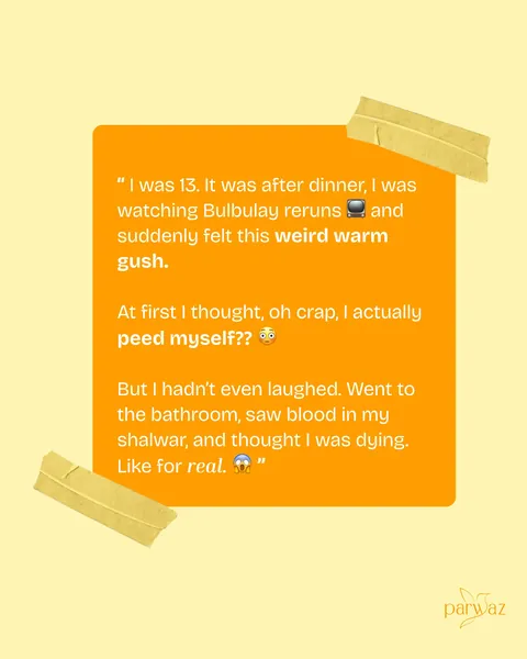
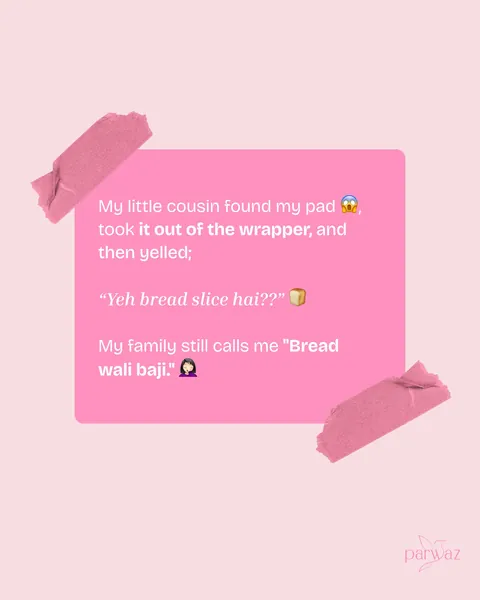
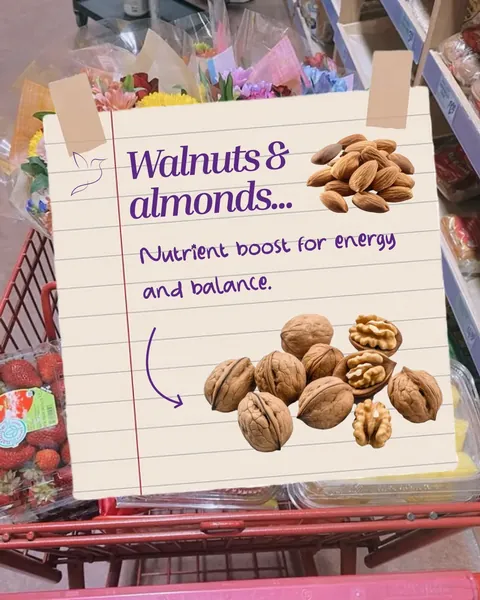
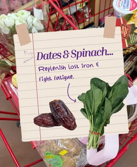
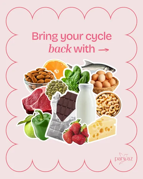
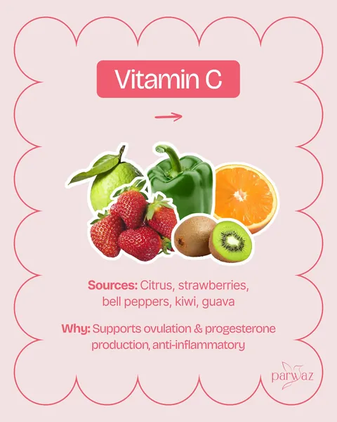
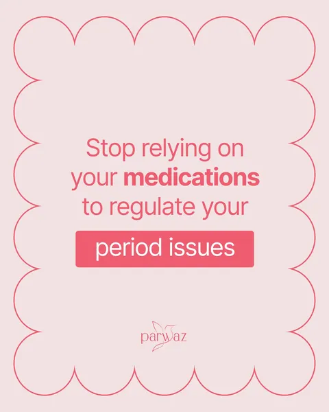
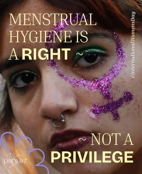
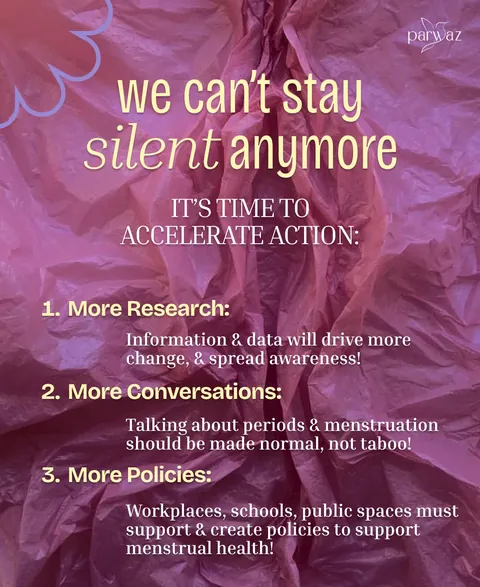
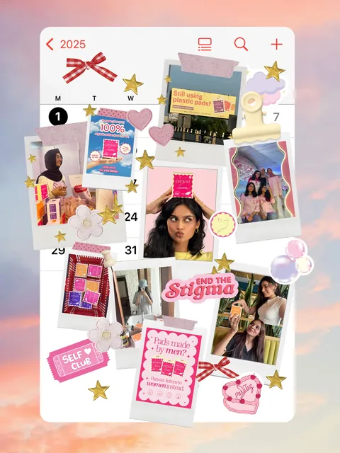
From the feed

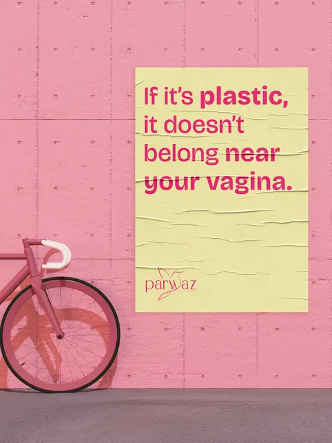


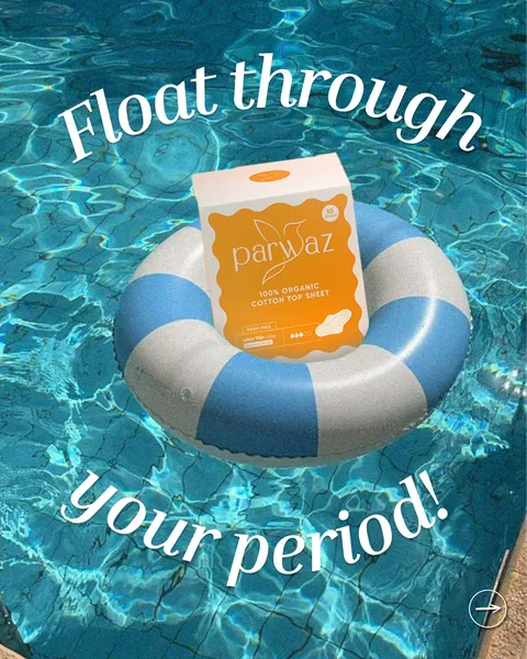


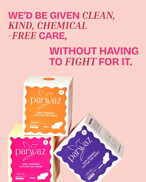


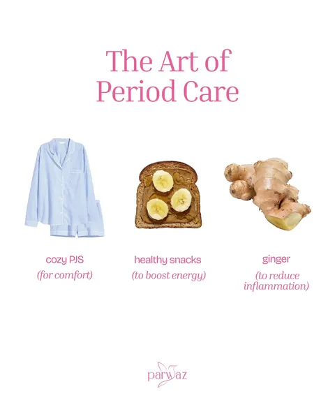






















How it came together
The name becomes a mark, and the mark becomes a system.
The system goes onto the box, built for the counter.
The product is photographed by the team that designed it.
The brand arrives on social media with one look.
The same team keeps running the marketing.
What we delivered
- Brand identity: the mark, color, type and usage rules
- Packaging design, from concept to print-ready files
- Shoots, directed by the team that designed the brand
- Launch content and the social media rollout
- Ongoing social media and marketing
The impact
Parwaz entered the market as a finished brand, not a work in progress. The mark, the box, the photography and the feed speak with one voice, because one team made all of them.
It also gave Parwaz something most new brands lack: a rulebook. Every new product, post and partner starts from a system instead of a blank page.
What building Parwaz taught us
A brand is easiest to protect on the day it is born.
Every handover is a chance for the idea to get lost.
The best packaging brief is written by the person who drew the logo.
Starting from a name? Bring us in early. The fewer the gaps, the stronger the launch.
More work


Assortment
Every image from our portfolio in one place, shuffled into a new order on each visit.
 Case study
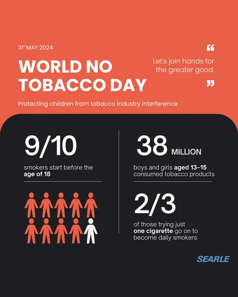
Searle
Four years as the social voice of one of Pakistan's leading pharmaceutical companies.
 Case study
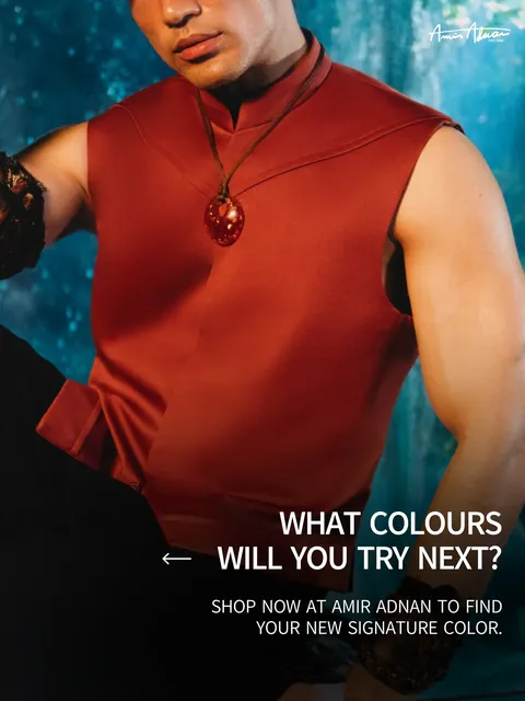
Amir Adnan
Three and a half years of social media, campaigns and shoot support for one of Pakistan's best-known menswear labels.
Ideas need good company.
Tell us what you're building.
Send a short brief. We'll reply within one working day with next steps, or an honest note if we're not the right fit.